Although every chart can have any category column of your choosing, its data columns -- which get plotted as bars or points or lines -- must be numeric data. That means you cannot plot values like "Emergent" or "Condition Green" or "ALS" as your chart's data points.
If you are wanting to plot those, it is probably because you are trying to plot the count of rows that have those values. In other words, you are probably trying to plot the number of calls that are "Emergent" or "Condition Green" or "ALS" or "brush fire", versus the number of calls that are not.
To achieve this, in the sidebar, drag the desired column down to the "Row Groups" box, and then drag the "Dispatch ID" column (or other record ID column) down to the "Values" box and change its aggregation function to COUNT. You can then chart the result, and it will show a count of rows for each of the values in the desired column.
Example Walkthrough
- From the Data Hub, select the "Dispatches-Overview" dataset, and then click the "Launch New Report" button.
- From the report's sidebar, in the "Columns" tab, deselect all columns by clicking the uppermost checkbox, the one next to the "Search" box.
- Still in the sidebar, drag the column "Service Level Provided" down to the "Row Groups" box.
- Still in the sidebar, drag the column "Dispatch ID" down to the "Values" box, and then click it to change its aggregation function from SUM to COUNT.
- From the grid, click and drag to select all visible rows and columns.
- Right-click the selection area, select "Chart Range", and select "Pie", and then "Pie".
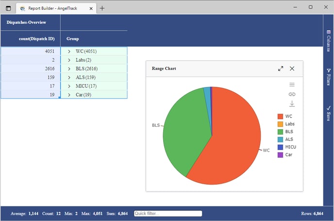
Here is how your completed chart will look:
This kind of report is ideal for pivoting, so take a look at the help for pivoting and pivot charts.