 The Report Builder is part of AngelTrack's Data Hub, available from the AngelTrack home page, and also from the "General" menu of the Billing Home page.
License Required
To use Report Builder, you must purchase a license for it, separate from your AngelTrack EMS and/or fire license. Report Builder will offer you a free trial so that you can assess its value before making any purchase decision.
All of Report Builder's datasets are freely available to you in the Data Hub, whether or not you purchase a Report Builder license. Therefore, anything that Report Builder can do, you can also do for yourself by exporting the relevant data to Microsoft Excel.
Role-Based Access Control
To use Report Builder, or the rest of the Data Hub, you must have one of the following security roles:
- Captain
- Biller
- HR
- Administrator
- Principal
Captains and HR who are not Billers and are not Administrators do not have access to the financial datasets, but can use all other features.
Choosing Datasets and Pre-Filters
To launch the Report Builder from the Data Hub, first select the datasets you wish to query.
All of AngelTrack's datasets are arranged into categories. Open the "Category" dropdown list to see the available choices. Most categories contain only a single dataset, but some have more than one dataset. If you select multiple datasets from the category, then AngelTrack will combine them into a superset.
Don't include more datasets than you need, because some of them contain dozens of columns and so will bog down your browser if you are pulling large numbers of rows.
Once you've made your dataset and pre-filter selections, click the "Launch Report" button. The Report Builder will then open, and will spend a few moments loading the data.
Sliding versus fixed date window
Some categories allow pre-filtering by a date range, so that you can narrow your selections before launching the report. For example, you might want to pull just the past 90 days. Pre-filtering by a date range ensures the report will not get overwhelmed by hundreds of thousands of rows and cause your browser to bog down.
The various choices like "Past 30 days", "Past 90 days", and so forth are sliding date windows. That means if you save the report and then run it again later, it will still pull the past 30 or 90 days leading up to the day you run it. Whereas you could create a different report that pulls a fixed date window, such as "Jan 01 2022 through Jan 01 2023", and whenever you run that report again in the future, it will still pull that exact date range.
You can change the date window later, from the "Save" tab in the report's sidebar. After modifying a report's date window, you must save the report, at which time it will automatically reload in order to apply the change.
Sidebar
The sidebar appears at the right-hand side of any report. It contains the list of datasets you selected, and their fields. This allows you to quickly add and remove columns from the report.
You can click and drag columns in the sidebar down to its Row Groups box to create a Group-By (discussed below) or an aggregation field (also below). The sidebar also allows you to switch to pivot mode; more about that later.
To close or reopen the sidebar, click again on its rightmost "Columns" or "Filters" menu.
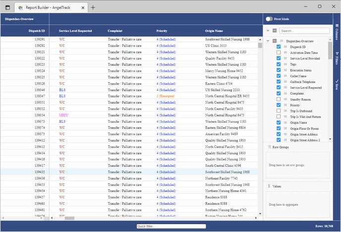
Pinned Columns
The first time you visit a report, you will see that AngelTrack has automatically pinned one or two columns to the left. Typically this will be a date column, such as the activation time of the trip, or the start time of a shift, or the date received of a payment event. Pinned columns remain in view even as you scroll to the right to view additional columns; they are like "freeze panes" in Microsoft Excel.
In the screenshot just above, you can see that that "Dispatch ID" column has been pinned to the left.
You can pin more than one column at a time. You can also unpin the columns that AngelTrack automatically pinned for you. To do so, mouse over the column heading, click the ≡ icon, and then open the Pin Column menu.
Column Sorting
To sort the grid, click any column header, same as you would elsewhere in AngelTrack.
To change the sort direction, click the column header again.
To clear the sort direction, click the column header a third time.
When you create a brand new report, if your data sets contain an appropriate date/time column (such as "Activation Time"), AngelTrack will automatically use it to sort the grid.
Sorting by multiple columns
To sort by more than one column, in a cascade, click your column's header to make it the primary sort column, then hold down SHIFT while clicking additional sort columns.
Group By Column
It's easy to group the data by the values in a column, so that, for example, you could divide up the grid into one section for each service level, or one section for each vehicle type, or any other subdivision. From any column heading, the ≡ icon opens a menu that includes a "Group By" function.
You can also click and drag columns from the sidebar's columns list to its "Row Groups" box.
You can even have multiple group-by columns, in a cascade, to divide and subdivide the rows into precise groups. For example, you could group by "Priority" (creating four groups), and then by "Service Provided" (creating three or four sub-groups within each priority). That would allow you to easily see just the emergent BLS, or just the scheduled wheelchair... similar to the way you would pick multiple filters in a regular AngelTrack grid to zoom in on certain rows.
If you are wanting to group by a date/time column, but are getting too many groups (one per date), then scroll down to find the "Grouping and Charting By a Date Column" section.
Aggregations / SUM and AVG and MIN and MAX
From the sidebar, you can drag any numeric column down to the "Values" box to create an aggregated column. By default, any new aggregation you create will be a SUM function, but there are many other choices, including AVG, COUNT, MIN, MAX, and so on, similar to Microsoft Excel.
Aggregated columns appear only if you have an active Group By column. For example, if you group by the Service Level Provided, you can then aggregate the Payments Received column to see the total or average of payments received for each service level group.
To change the aggregation function, find the aggregated column in the sidebar's "Values" box and click the ∷ icon to open its properties.
There are some special aggregation functions available, with names like "percentGreaterThan", "percentLessOrEqualTo", "countGreaterThan", and "countLessOrEqualTo". They are explained just below, in the help section for counting rows whose values are above or below a threshold.
Gradient coloration of AVG aggregations
When using the AVG aggregation, you will notice that AngelTrack colors the results on a brown-white-blue scale, to help you visualize the range, like this:
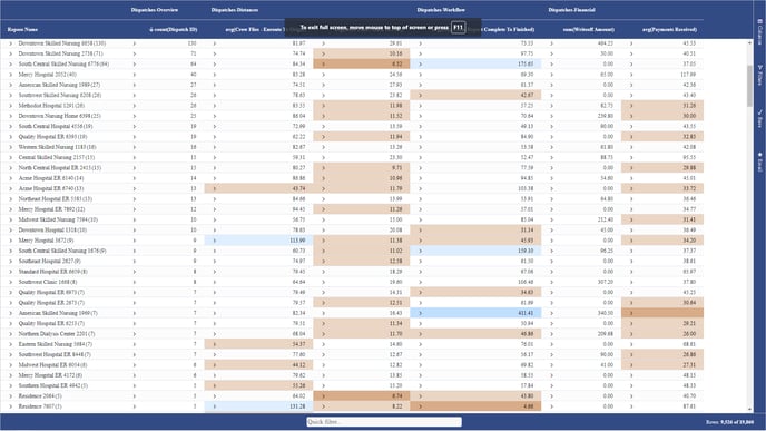
Brown values are those falling below the net average value, while blue values are above it, in the sense of "Earth below, sky above". The coloration divides the data range into quintiles, marking the 0%-20% range in dark brown, 21%-40% in light brown, 41%-60% in white, 61%-80% in light blue, and 81%-100% in dark blue. This coloration is useful for identifying outliers.
Quick aggregations
If you want to quickly see a SUM, AVG, MIN, MAX, and COUNT for a group of rows without setting up an aggregation column, just click+drag over the cells you wish to count, and the answers will appear in the status bar at the bottom-left of the screen.
Filtering by Column Values
To include or exclude rows according to certain values in a column, mouse over the column header, click the ∷ icon to open the menu, and then click the ∇ icon to switch to the filtering tab. From there you can select which values to include or exclude.
You can do the same thing from the Filters tab on the sidebar at the very far right.
All of Report Builder's datasets automatically filter out records that are marked as deleted, inactive, or merged into another record. Any dispatch whose Execution Status is "Cancelled" is automatically filtered out of all categories and datasets except for "Dispatches - Cancellations".
Common filters
For most reports, depending on your goals for the report, these filters should be considered for your starting filter set:
- Execution Status = not "Delegated to Affiliate"
- Is Billable = true
- Transport Disposition = "Transport by this EMS unit" values
...in order to eliminate records that are irrelevant or otherwise will not contain data that is meaningful for your report.
Quick filtering
At the bottom of every report there is a "Quick filter" textbox, where you can type a few characters to filter out all rows that don't have those characters in any visible cell.
Filtering by crew members onboard
There are a couple different ways to accomplish this task. For details, have a look at the Filtering Trips By Crew Member Walkthrough.
Counting rows whose values are above or below a threshold
If you want to count rows based on a certain column value, such as "How often are we spending more than 30 minutes on scene?" in order to calculate a percentage, don't use a column filter, because column filters remove rows entirely from the grid, and therefore make it impossible to calculate a percentage. Instead, use one of the "countLessOrEqualTo", "countGreaterThan", "percentLessOrEqualTo", or "percentGreaterThan" aggregations.
For example, if you picked "percentGreaterThan30" as your aggregation function, then it would calculate the percentage of all rows where the selected column contains a value above 30.
To see an example of this technique, refer to the Percent of Rows Above or Below a Threshold Walkthrough.
Adding a Chart
To add a chart to the grid, first you must select a range of data for it. To do so, click+drag across the grid to select the rows and columns to include, same as you would do in Microsoft Excel.
A chart's selection area must be contiguous, so you may need to rearrange your columns in order to bring together all the ones needed for the chart. (Rearranging columns is easy: From the grid's header row, just click and drag each column's header left or right.)
Once you've got your data selected, right-click the selection, choose "Chart Range" from the menu, and pick the type of chart you prefer. When the chart appears, if AngelTrack has not already correctly guessed which column is the category and which columns are the series, click the ≡ icon in its menu at the top-right corner, and choose the "Data" tab. You can then redesignate the category and series.
If you would like step-by-step instructions, take a look at the Simple Chart of Average Values Walkthrough.
You can also change the chart type, again by clicking the ≡ icon in its menu at the top-right corner. Indeed, you can change everything about the chart's layout and presentation from that menu.
Afterward, you can readjust the chart's range (the area of rows and columns to be plotted) using the drag handle located in the bottom-right corner of the chart's blue selection box in the grid. You can also modify your report's filters, and the chart will automatically update to show the new results.
To download an image of the completed chart, click the ⤓ icon in the chart's menu at the top-right corner.
Charting a Non-Numeric Column
Although a chart can have any category column of your choosing, its series columns -- which get plotted as bars or points or lines -- must be numeric data. That means you cannot plot values like "Emergent" or "Condition Green" or "ALS" or "Structure fire" as your chart's data points.
If you are wanting to plot those, probably you are trying to plot the count of rows that have those values. In other words, you are probably trying to plot the number of calls that are "Emergent" or "Condition Green" or "ALS" or "Structure fire" or whatever, versus the number of calls that are not.
To achieve this, in the sidebar, drag the desired column down to the "Row Groups" box, and then drag the "Dispatch ID" column (or other record ID column) down to the "Values" box and change its aggregation function to COUNT. You can then chart the result, and it will show a count of rows for each of the values in the desired column.
For a demonstration of this technique, refer to the Plotting a Non-Numeric Column Walkthrough.
This situation is also ideal for pivoting, so take a look at the help section on pivoting and pivot charts, below.
Grouping and Charting By a Date Column
Sooner or later, you will probably want to organize some data by the month and year when it occurred. For example, you may want to plot your cash receipts month-over-month. If you try to do this with a date/time column, such as "Received Date" or "Activation Date", it will probably yield too many groups, or too many X axis points in your chart, because you get one group for each day in the range.
To work around this, most date/time columns in AngelTrack's datasets have a companion column that contains just the year and month. For example, for the "Activation Date" column in the dataset Dispatches-Overview, there is an "Activation Month" column that contains just YYYY-MM, such as "2023-02", "2023-03", "2023-04", and so on. This companion column is a fine choice for row groups, and for the category column of a chart, whenever you are looking to see month-over-month results.
To see a demonstration of this, refer to the Months as Columns Walkthrough.
There are also special "Age Bracket" columns that show the age of a receivable or invoice according to its accounting age: 0-30 days, 31-60 days, 61-90 days, and so forth.
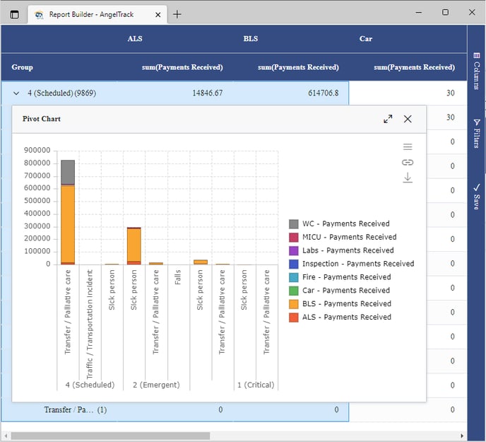
Pivoting
To pivot your data, follow these steps using the sidebar at the upper right:
- Activate the "Pivot Mode" switch at the top of the sidebar.
- From the datasets/columns list, click to add the columns you wish to group by. For example, you might group by Priority, then by Complaint, in order to see a breakdown of the types of responses you provided.
- From the datasets/columns list, find one or more columns you wish to aggregate, and drag them to the "Values" box. For example, you might aggregate the Payments Received column in order to see what you were paid for the responses. The grid will then show the aggregation of each row group.
- From the datasets/columns list, select a column to subdivide the analysis, and drag it to the "Column Labels" box. For example, you might subdivide based on Service Level Provided, or on the Activation Month. The grid will then subdivide each row group's aggregation according to service level.
- To add a chart, right-click anywhere in the grid, choose "Pivot Chart", choose "Column", and then choose "Stacked". Here is how your chart will look:
Counting rows in a pivot chart
If you want row-counts in a pivot chart, such as for counting how many trips ran with lights and sirens versus how many did not, go to the sidebar, switch to the "Columns" tab, find the very first column (usually named "Dispatch ID" or "Employee ID" or some other record ID), drag the column to the "Values" box, and then click it to change its aggregation function to COUNT. You will then see the count of all rows in each pivot category.
To see an example of this technique, refer to the Counting Rows in a Pivot Chart Walkthrough.
Months as columns
Probably the most common real-world use for pivot charts is a 12-column chart -- one column per month. These are very easy to create in Report Builder, using the "by month" columns built-in to most datasets. To see how to create one, refer to the Months as Columns Walkthrough.
HCPCS codes as columns
It is similarly easy to make a pivot chart with HCPCS codes as the columns, in order to show sums or averages for each billing code. To see how, refer to the Pivot on HCPCS Codes Walkthrough.
Notable Columns and Disclaimers
A few of the columns in AngelTrack's datasets are complex or have non-obvious behavior, and so require explanation. Take a look at the Datasets and Columns Notes to learn more.
Pagination / Very Large Row Count
If your report contains vast numbers of rows such that your web browser bogs down and becomes too slow, you can switch to a paginated report. Pagination will keep only a subset of rows in view at a time, with page-forward / page-back controls at the bottom right, similar to how regular AngelTrack grids offer pagination controls when they contain more than 100 rows.
To enable or disable pagination, open the "Save" tab in the sidebar, and click the pagination tickybox. Your change will not take effect until you save the report, at which point it will automatically reload to apply the change.
Another option to fit more rows and columns on your screen is to activate your browser's zoom control. On Windows, use CTRL + WHEELDOWN to shrink all page content so that more will fit on your monitor.
Viewing an Underlying Record
If you would like to view the underlying record -- such as the underlying dispatch, or vehicle, or employee, or what have you -- then find the relevant ID column. It will be named "Dispatch ID" or "Vehicle ID" or "Employee ID" or similar. Right-click that cell, and AngelTrack will show a "Go to..." option in the popup menu. Clicking the go-to option will open a new browser tab containing the relevant AngelTrack page.
All cells that have this jump-off capability will show a ![]() icon when you mouse over them.
icon when you mouse over them.
Pulling a PDF of the underlying PCR
If you scroll left or right in your report to find the "Dispatch ID" column, and then right-click it, you will see a "Go to This PCR" option, allowing you to directly open the PCR for that trip, plus some additional options for printing the PCR or downloading it as a .PDF. In this manner, after you've got your report nicely filtered, you can download all the PCRs that match the filter.
Exporting to CSV or Excel
To export the grid to a .CSV or .XLSX file, right-click any cell, and then visit the Export menu in the popup. AngelTrack will always export the entire grid, even if you've only got a subset of columns selected.
You can also find the standard export icon ![]() in the sidebar's "Save" panel and also in its "Email" panel.
in the sidebar's "Save" panel and also in its "Email" panel.
Excel has more powerful print features than does your web browser, so if you are having trouble getting a very large report to print correctly, try exporting it to Excel and then print from there.
Deeper Analysis / Complex Expressions
The Report Builder does not have all the functionality of a dedicated spreadsheet application like Microsoft Excel or Google Sheets. If you are building a report and need these advanced functions, simply export the data to .XLSX and then continue your analysis in your favorite spreadsheet.
Once you get your columns, layout, and pre-analysis done in Report Builder such that it exports just the way you like for your spreadsheet application, remember to save the report in AngelTrack, so you can re-run and re-export to .XLSX whenever you wish.
Saving Your Report
In the sidebar at the right, you will find a "Save" tab that allows you to name and save the report., so that you can re-launch it later, right where you left off.
You can also mark it 'Public' if you wish to allow other users who are not Administrators to run it and potentially modify it.
Saving changes to a built-in report
Report Builder contains a variety of built-in reports. Their ID numbers are all below 1000, while all user-created reports have ID numbers equal to or greater than 1000.
You can modify the built-in reports all you like to suit your needs. After you do so, the modified reports will no longer be automatically updated with improvements as AngelTrack LLC may ship from time to time. To avoid this, when you modify a built-in report, use 'Save As' to create a copy of it. You could then mark the built-in report as deleted; AngelTrack LLC will continue to keep it updated with the latest improvements, but it will no longer appear in your reports picklist.
Re-Visiting a Saved Report
From the Data Hub, you can review the dropdown list of saved reports, and launch any one you wish. The list is organized by the identity of the reports' authors, so all of your own reports will be together.
The list will show only those reports to which you have access. You must have biller or administrator access to run any report that contains billing data. You must have administrator access to run a report that someone else created if they did not mark it "public".
Remember that every report saves its date window, so if you chose a sliding date window like "Past 90 days", then your report will always load the past 90 days of data, and thus the data will change from what it showed in the past, along with any charts and aggregations that depend on the data. Whereas if you chose a fixed date window like "Jan 1 2022 through July 1 2022", then the report will always load that exact date range.
Sharing Reports with Others
Users who are Administrators can always view and edit reports created by others.
Users who are not Administrators but who are Billers can view and edit reports created by others if the reports are marked "Public". (You can set or unset the "Public" flag in the "Save" dialog in the report's sidebar.)
Users who are not Administrators and not Billers but who are Captains can view and edit reports created by others if the reports are marked "Public" and do not contain any financial-data datasets.
Managing Saved Reports
From the Data Hub you can click the "Managed saved reports" link to visit a grid of all saved reports visible to your user account. From there, you can launch them, duplicate them, or delete and undelete them.
Deleted reports are preserved for a time period according to the Data Lifetime Schedule.
Sending Reports Via Email
You can one-click send your report and its chart(s) via email, using the "Email" panel in the sidebar. You can also run and email your report from the Report Builder Reports grid, which is accessible from the "Manage saved reports" link in the Data Hub.
To learn more about Report Builder's email capabilities, refer to the Email Reports from Report Builder Guide.
HIPAA / PHI Journalling
The following datasets contain PHI:
- Dispatches-PatientIdent
- Patients
- Patients-Seen
- PaymentEvents-NonZero-Patients
- PaymentEvents-Zero-Patients
Any time any employee runs a report which contains one of these datasets, AngelTrack will log a HIPAA access journal entry for every patient record that was included by the report's query... even if no PHI columns were ultimately displayed by the report.
Furthermore, these datasets might set off your AngelTrack server's exfiltration alarm, if you are pulling thousands of rows. If you regularly do so, then you might need to adjust the exfiltration tripwire (available from the Preferences page under Settings) to give you more room.
Questions?
Before calling support, please have a look at the Report Builder FAQ.